PINACLE
Reimagining the PINACLE Dashboard Experience
A customizable dashboard that transforms treasury users' daily workflow — surfacing what matters, reducing friction, and driving faster decisions across 24+ product teams.
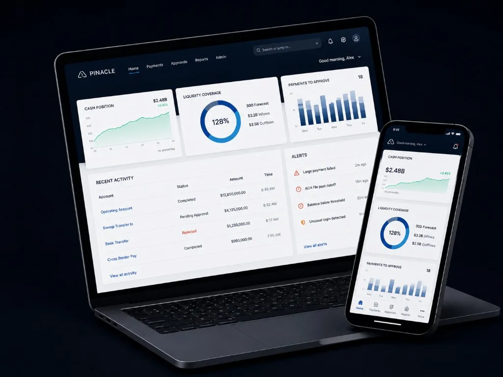
At a glance
- 24+ product teams
- 4 key user roles
- 12 research participants
- 1 scalable widget framework
The user moment
The First 60 Seconds on PINACLE
Treasury managers log in before market open, meetings, approvals, and deadlines. The dashboard needed to answer one question quickly: what matters most right now?
Help users act with confidence by surfacing priority, context, and control the moment they land.
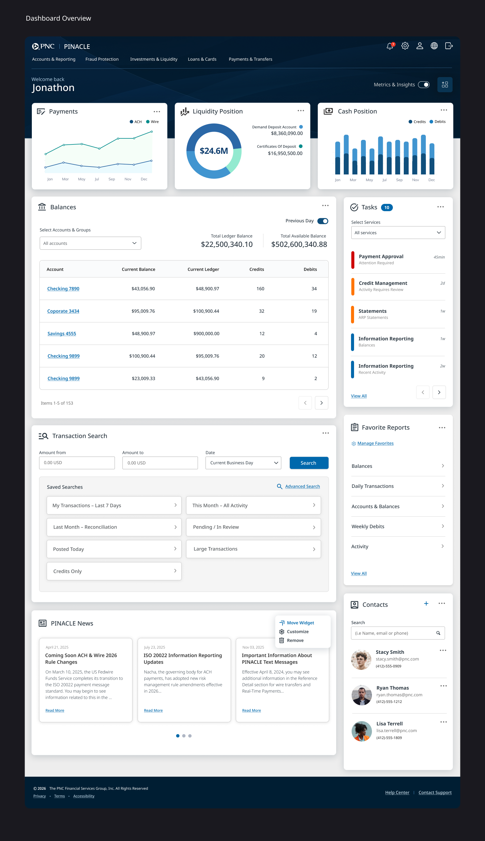 12345
12345- 1
Global account context
Set the right data for the right entity.
- 2
Priority actions
Surface approvals, exceptions, and time-sensitive tasks.
- 3
Cash position snapshot
Bring liquidity into immediate view.
- 4
Alerts & exceptions
Surface risks and outliers early.
- 5
Widget customization
Make it yours. Save it. Come back to it.
The transformation
From Static Homepage to Operational Workspace
A static homepage that hadn’t evolved with PINACLE — re-platformed as a configurable workspace built around insight and action.
Before
Static homepage
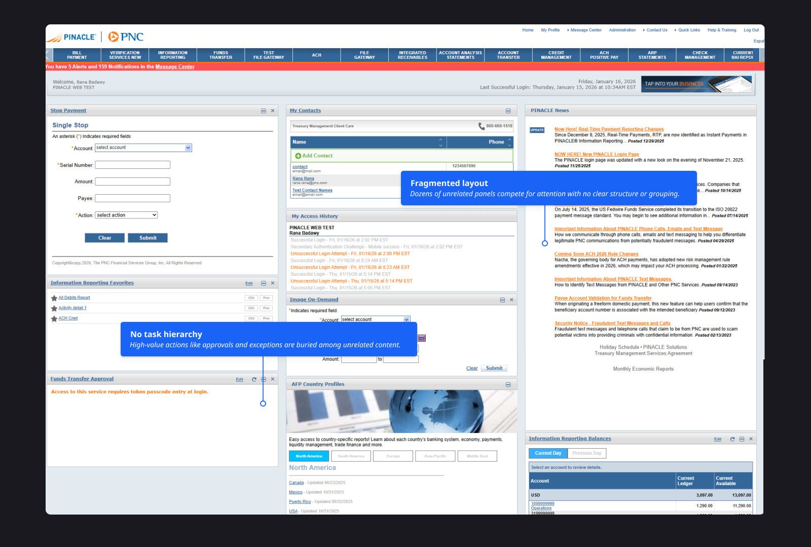
- ×No task prioritization
- ×Fragmented experience
- ×Limited personalization
- ×Weak operational context
After
Operational workspace
- ✓Priority widgets prioritized
- ✓Widgets & layout user-tunable
- ✓Real-time alerts and exceptions
- ✓Scalable across 24+ teams
Key design moments
Why the Legacy Dashboard Fell Short
The legacy dashboard hadn't evolved in over a decade. As new PINACLE services were added, the homepage stayed largely static — accumulating a fragmented mix of patterns instead of a coherent entry point.
One-size-fits-none
One rigid layout failed analysts, operators, and executives alike — without meaningful ways to tune the surface to different roles.
Low signal-to-noise
High-value work like approvals, exceptions, and alerts competed with everything else — so critical tasks were easy to miss.
Fragmented insights
Widgets and treatments varied by service with no shared model. Clients saw inconsistent behavior across PINACLE.
Outdated experience
The UI no longer reflected the depth of modern PINACLE capabilities — undermining trust in the platform.
Overview
What the Redesign Introduced
A task-first, customizable entry point built to scale across dozens of services without fragmenting the experience.
Configurable dashboard
A widget-based surface tailored to different roles and workflows — so the homepage matches how people actually work.
Shared widget framework
A common model so 24+ product teams could ship independently while keeping behavior predictable for clients.
Continuous validation
A feedback loop through client sessions and PINACLE User Group testing pressure-tested layouts and widget states.
Key learnings
What We Learned from Treasury Users
We ran client interviews, workflow walkthroughs, and prototype tests at PINACLE User Group sessions. Consistent patterns emerged across roles and workflows.
What we heard
”I need the right data for the right entity — instantly.”
What it meant
Users can’t hunt across services under time pressure.
Design response
Priority widgets and alert surfaces.
What we heard
”Don’t make me click through five screens.”
What it meant
Stale or unclear information damages trust.
Design response
Freshness indicators and transparent states.
What we heard
”My team needs a view that fits how we work.”
What it meant
A single homepage can’t serve every role.
Design response
Configurable widgets with governed components.
What we heard
”I want the freshest, most accurate information I can rely on.”
What it meant
Product teams need flexibility without UI fragmentation.
Design response
Real-time data, clear states, and transparency.
Leadership
Leading the Dashboard Program
As UX Manager and Design Lead, I balanced ownership of the model with how we collaborated across a large enterprise footprint.
Widget governance model
The widget contract and definition-of-ready that let 24+ product teams contribute consistently to the platform.
Client-validated, cross-team
Live prototype testing at PINACLE User Group · partnership with two lead designers · facilitation across stakeholders.
Shell → widgets → governance
Clear handoffs and checkpoints so parallel teams stayed aligned without fragmenting the client experience.
Key design decisions
Balancing competing needs to create a better experience
Surface signal first, depth on demand
We led with insight, then layered in action — so users could orient before they had to decide.
Governed widget library
A flexible widget framework with built-in guardrails to keep PINACLE coherent.
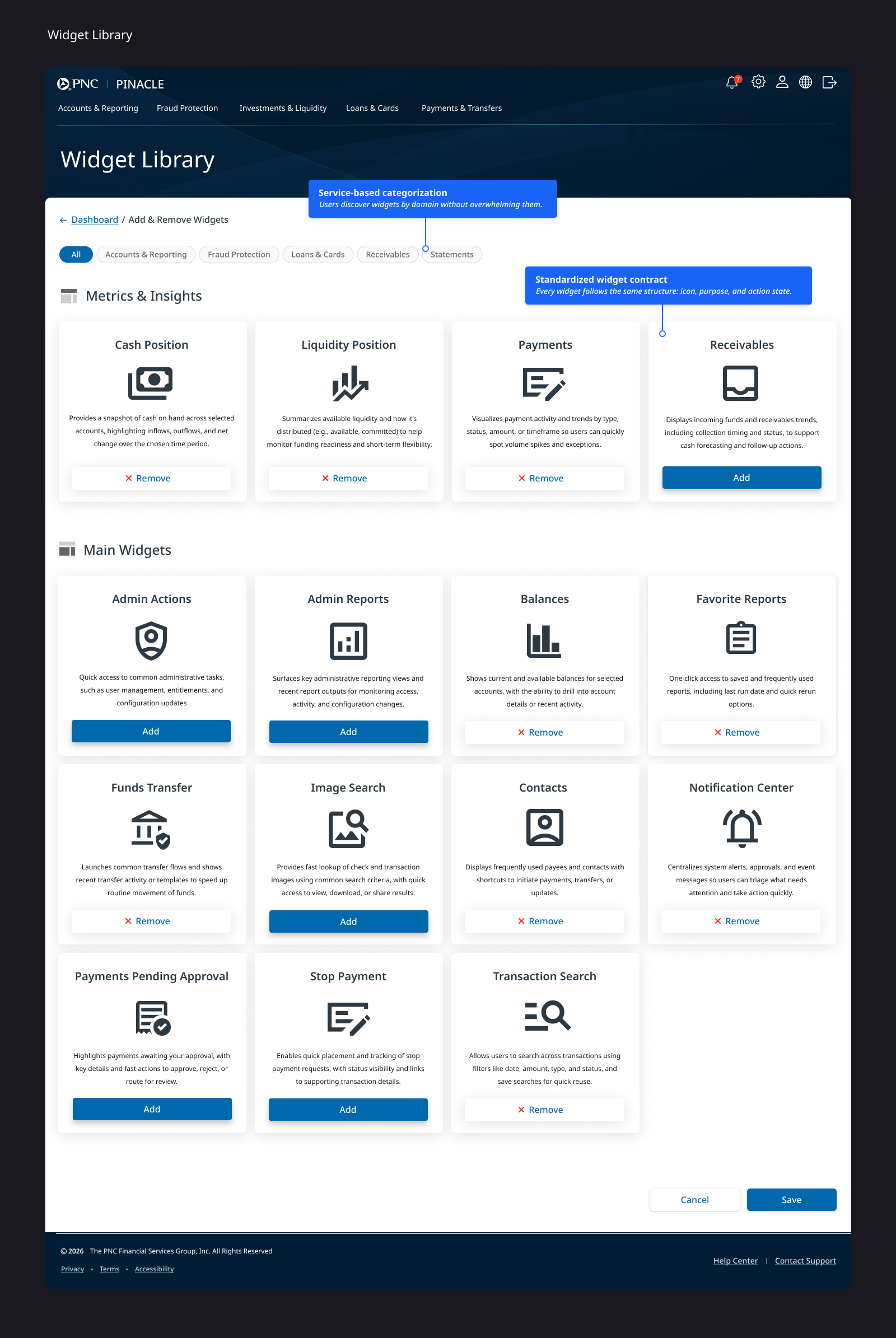
A shared widget contract
We provided the standards teams need to ship a shared, consistent experience.
Built on a reliable foundation
We designed for evolution to enable a scalable architecture and clear evolution.
The solution in detail
Structuring the Dashboard Around Insight and Action
A task-first, customizable dashboard built by separating insight from action and standardizing how widgets behave across services.
Layout model
Predictable zones for insight, analysis, and action
An insights strip for always-visible health indicators, a main area for analysis-heavy widgets (balances, reporting, transfers), and a sidebar for small, actionable items (approvals, exceptions, contacts, favorites).
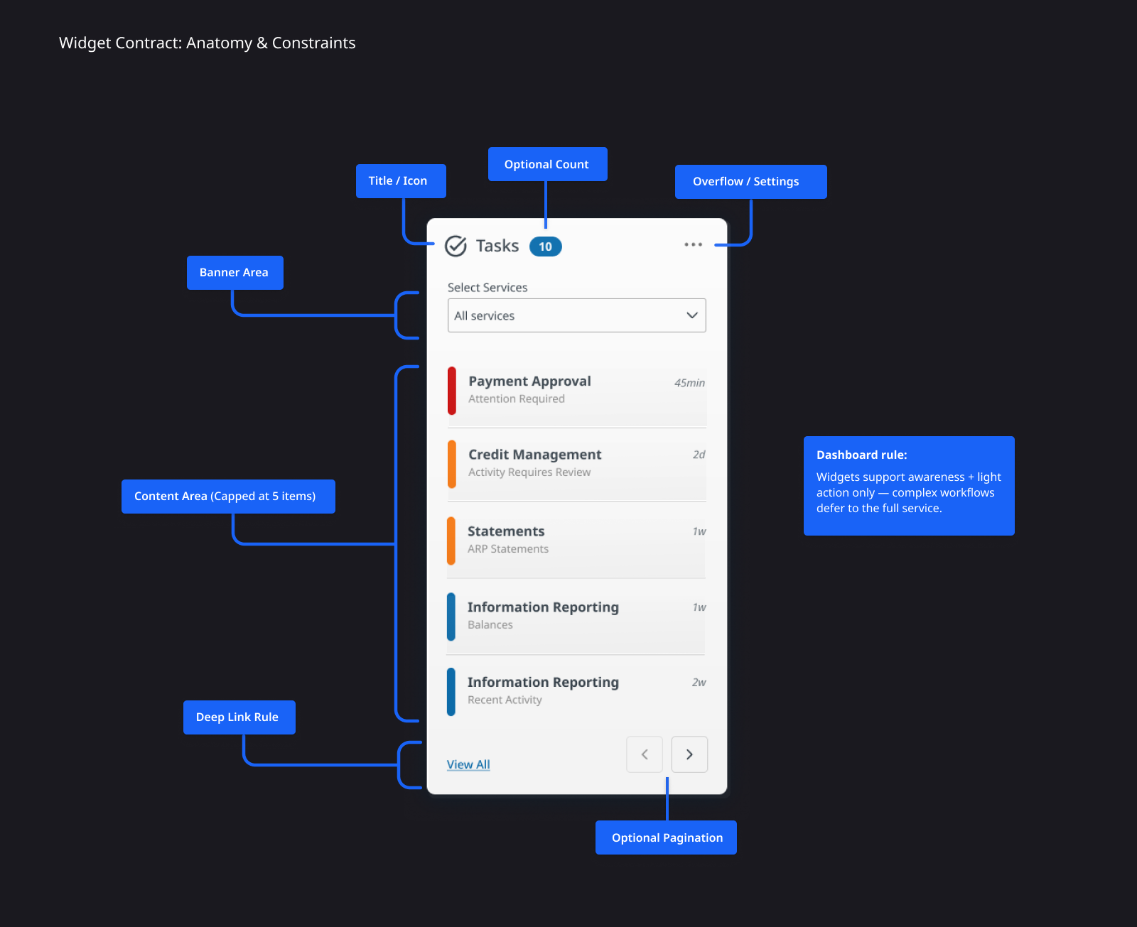
Widget system
Shared anatomy, defined boundaries
A service-based widget library lets users add and remove modules without clutter, while a shared contract defines anatomy, capped content, deep-link boundaries, and optional controls — keeping implementation aligned across 24+ services.
Interaction
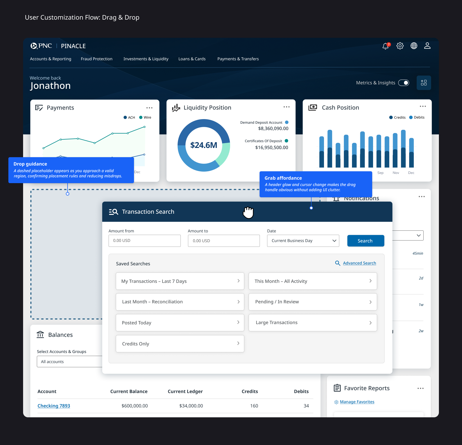
Drag, place, confirm
Customization uses drag-and-drop into defined drop zones with clear save and confirmation — so layouts stay legible and users understand when changes persist.
Validation
Validating Dashboard Customization
We pressure-tested the dashboard concept to ensure treasury users could understand personalization, trust widget data, and confidently shape their workspace.
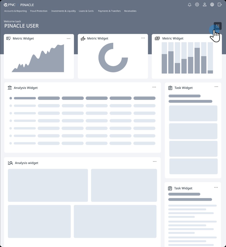
Step 1 of 5
Add widget entry point
Users begin customization by selecting the add-widget control from the dashboard.
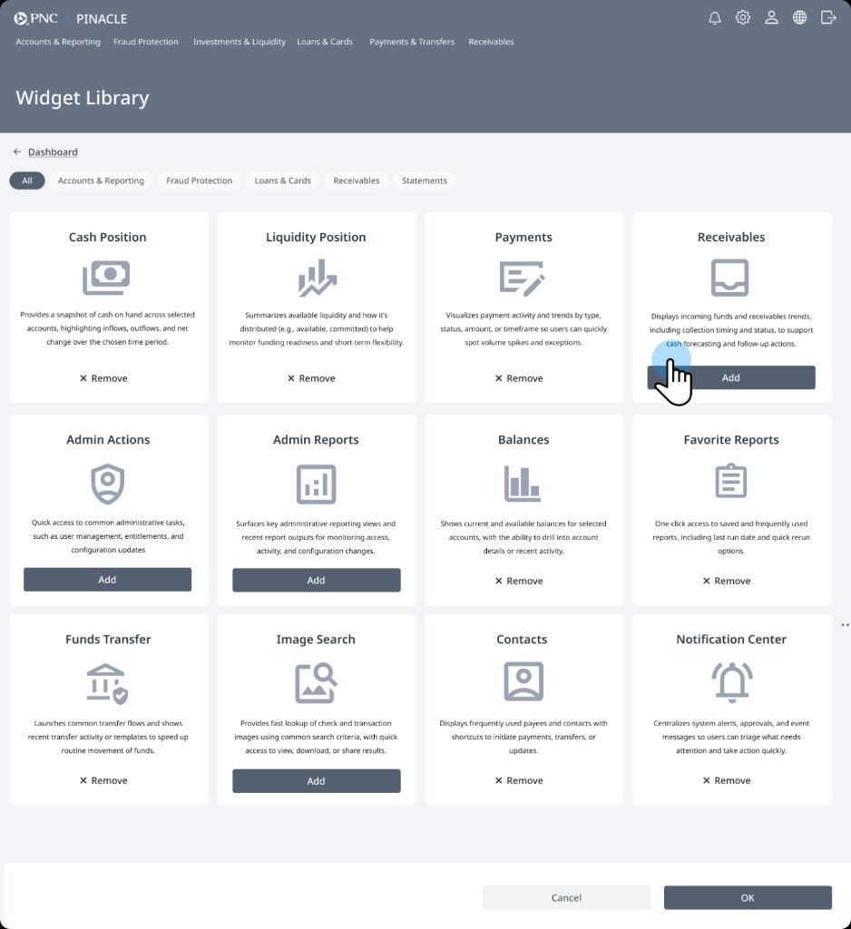
Step 2 of 5
Widget library
The widget library displays available tools across the platform. Users browse and choose the information they want on their workspace.
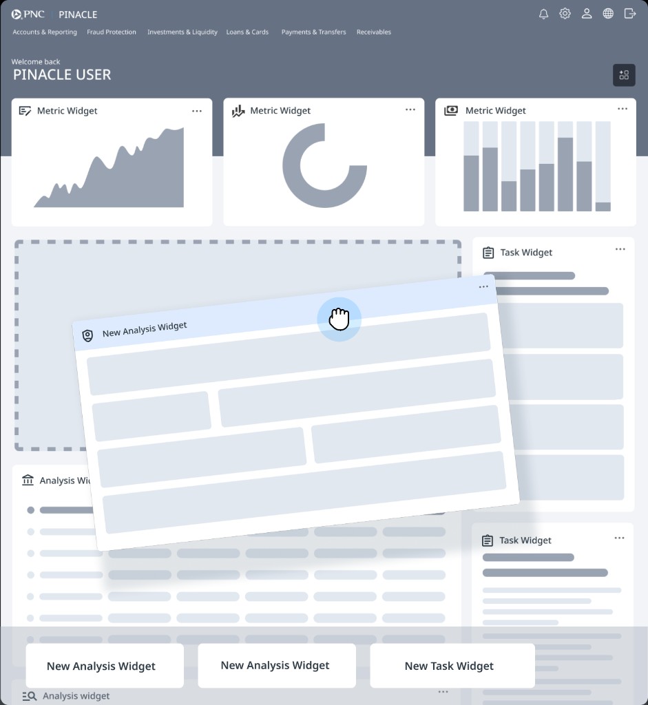
Step 3 of 5
Drag and place
Selected widgets can be placed directly into layout zones, allowing users to tailor the dashboard to their workflow.
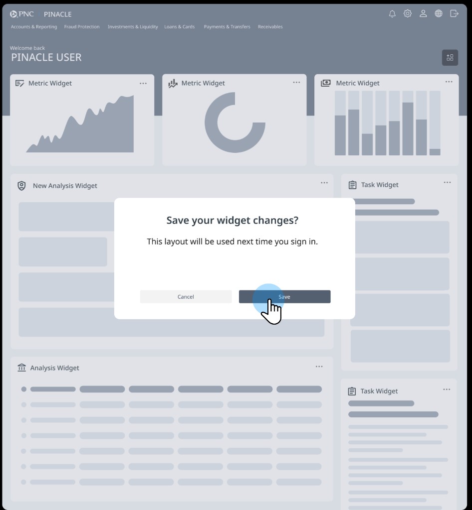
Step 4 of 5
Confirm layout
A confirmation step ensures layout changes are intentional and prevents accidental dashboard edits.
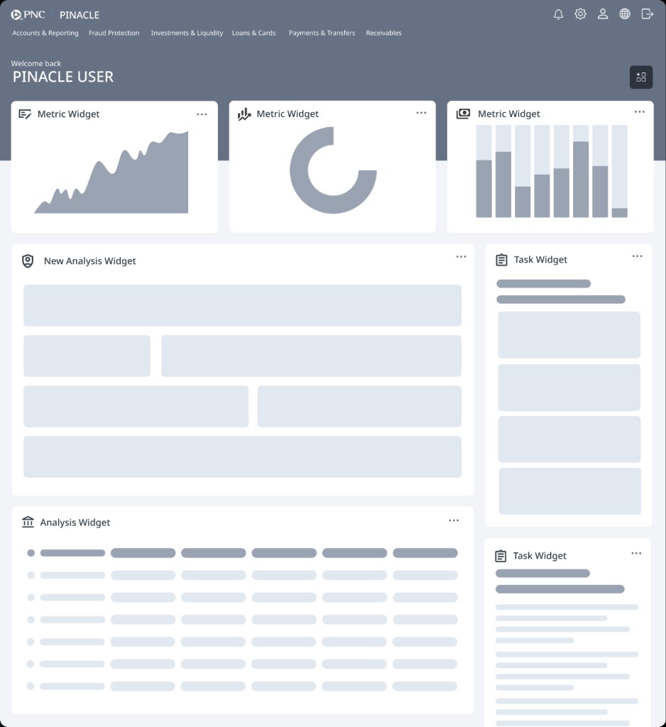
Step 5 of 5
Updated workspace
The new widget appears in the dashboard and the personalized layout becomes the user’s default workspace.
The system behind the system
Scaling the Framework Across Teams
We designed a widget-based framework and governance model that enables consistency for clients and flexibility for teams.
Dashboard Shell
Consistent layout, navigation, page behavior, and dashboard structure.
Widget Contract
Defined states, data requirements, permissions, configuration, loading, empty, and error patterns.
Product Team Widgets
Reusable, configurable widgets built by product teams for specific business needs.
Governance & Design System
Standards, review, accessibility, and quality components.
24+ Product Teams
Aligned teams able to contribute consistently to the platform.
The impact
What Changed
A better user experience for treasury users — and a scalable foundation for the enterprise.
Faster decisions
Users could identify critical tasks and insights faster.
Improved trust
Real-time data, clear alerts, and confidence patterns drove decision-making.
Scalable adoption
A reusable framework enabled 24+ teams to ship more consistently together.
Stronger foundation
Governance and design-system quality created a foundation for future growth.
Reflection
Leading Through Scale and Ambiguity
This project required not just design innovation, but orchestration across dozens of teams and stakeholders. My role was to keep the vision unified, ensure client voices were consistently represented, and give developers clear requirements for complex workflows.
Leading this effort reinforced the importance of balancing strategic direction, hands-on design work, and cross-functional facilitation in large-scale enterprise design programs.
Orchestrate, don’t dictate
Align dozens of teams around shared contracts and guardrails.
Create clarity in ambiguity
Define ownership, states, and expectations before development begins.
Stay close to users
Validate decisions continuously through client sessions and testing.