PNC — Reimagining the PINACLE Dashboard Experience
A customizable, widget-based dashboard designed to give treasury users immediate visibility into critical financial activity and enable faster decision-making.
For over a decade, the PINACLE dashboard served as a static entry point into a complex corporate banking platform. As client needs evolved, the experience struggled to surface the most relevant information and required users to navigate across multiple services to complete routine tasks.
This project explored how a modular, customizable dashboard could provide real-time visibility into key signals—such as cash position, approvals, and exceptions—while enabling users to take action directly from the homepage.
My Role
UX Manager · Design Lead · Product Strategy · Design System Alignment
Highlights
- Led the redesign of a decade-old static dashboard into a customizable, widget-based experience
- Defined a scalable widget framework adopted across 24+ product teams within PINACLE
- Validated layouts and interactions through usability testing with treasury users across multiple roles

The User Moment
A treasury manager logs in to get situational awareness—cash position, approvals, and exceptions—before upcoming meetings and cutoff times.
In the legacy experience, key signals and high-frequency tasks were scattered across multiple services, requiring users to navigate across the platform just to understand what needed attention.
The goal was to make the first 60 seconds on PINACLE immediately actionable—surface what matters most, and enable users to take action without unnecessary navigation.
BEFORE / AFTER
The legacy experience was a static entry point; the new dashboard is a customizable, signal-first surface that routes users to work without hunting across services.
Legacy

New dashboard

OVERVIEW
The PINACLE dashboard hadn’t been modernized in over a decade, leaving clients with a static homepage that didn’t prioritize day-to-day tasks. I led a redesign to create a task-first, customizable entry point—built to scale across dozens of services without fragmenting the experience.
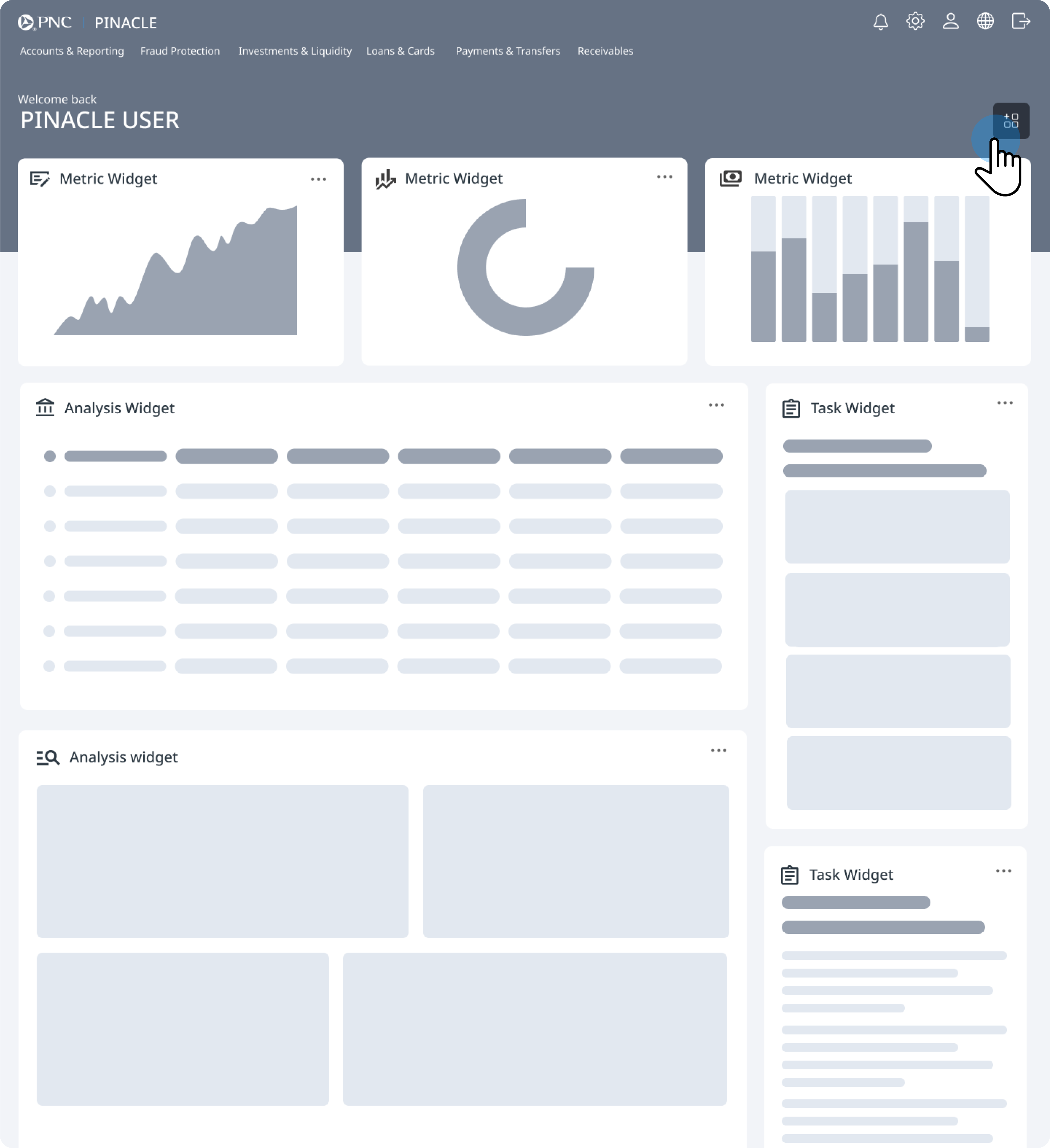
Configurable dashboard
A widget-based surface tailored to different roles and workflows—so the homepage matches how people actually work.
Shared widget framework
A common model so 24+ product teams could ship independently while keeping behavior predictable for clients.
Continuous validation
A feedback loop through client sessions and PINACLE User Group testing to pressure-test layouts, customization, and widget states.
- See what matters first
- Act without unnecessary navigation
- Scale without fragmentation
ROLE / TEAM
As UX Manager / Design Lead for the PINACLE Dashboard program, I balanced ownership of the model with how we collaborated across a large enterprise footprint.
What I owned
- The widget governance model and “widget contract” so 24+ product teams could contribute consistently.
- A definition of ready for widgets—states, data needs, and edge cases—to reduce late-stage rework.
- Hands-on artifacts: north star flows, prototypes, and interaction requirements to unblock engineering.
How I worked
- Client validation across multiple rounds—interviews and live prototype testing at PINACLE User Group.
- Partnership with two lead designers within a 7-designer UX org to align widget work across dozens of product teams.
- Facilitation across stakeholders so teams could ship independently without fragmenting the client experience.
CONTEXT / PROBLEM
What wasn’t working
The legacy dashboard was antiquated, rigid, and cluttered:
- One-size-fits-none: limited customization for very different roles
- Low signal-to-noise: high-value tasks (approvals, exceptions, alerts) were hard to spot
- No consistency: insights and widgets varied across services with no shared model
- Outdated experience: UI didn’t reflect PINACLE’s modern capabilities
What the redesign needed to achieve
Design a flexible, modern dashboard that:
- Scales across dozens of services and evolving use cases
- Balances insights and action—data visualization plus clear task prioritization
- Enables customization without unnecessary complexity
- Can be maintained by multiple product teams with governance over time
RESEARCH / DISCOVERY
We ran client interviews, workflow walkthroughs, and prototype testing to understand what corporate users expect from a dashboard—and to validate a widget model that can scale across PINACLE services. We also tested iterative prototypes with clients at the annual PINACLE User Group to confirm layout patterns, customization behavior, and widget state expectations.
Client interviews · Workflow walkthroughs · Prototype testing · PINACLE User Group sessions
Corporate banking and treasury users across multiple roles—validated in structured sessions with real client workflows.
Dashboard expectations · Widget model scalability · Layout patterns · Customization behavior and widget states
Zone + widget comprehension · Personalization entry points · Trust in data freshness · Predictable empty/loading/error patterns
What we learned
- Approvals and exceptions must be fast to find—even if final review happens in the full service flow.
- Balances and key indicators need to be visible at a glance without digging through reports.
- Roles vary enough that customization is required, but the model must stay simple and predictable.
- Trust comes from freshness and clarity: labels, consistent widget behavior, and well-defined states (loading, empty, error, no access).
- Many users want a quick “approval inbox” view, but still complete approvals in the full service for review and confidence.
KEY DESIGN DECISIONS
Three tensions shaped the solution—each decision balanced user needs with what 24+ teams could ship consistently.
Tension · Analysis vs. action compete for attention on a single surface.
Separate “insight” from “action” with a clear layout model.
A metrics strip for awareness, a main zone for deeper analysis, and a sidebar for high-frequency tasks keeps scanning predictable—so users see signal first and route to work without guessing where tasks live.
Tension · Roles vary widely, but ad-hoc layouts erode trust.
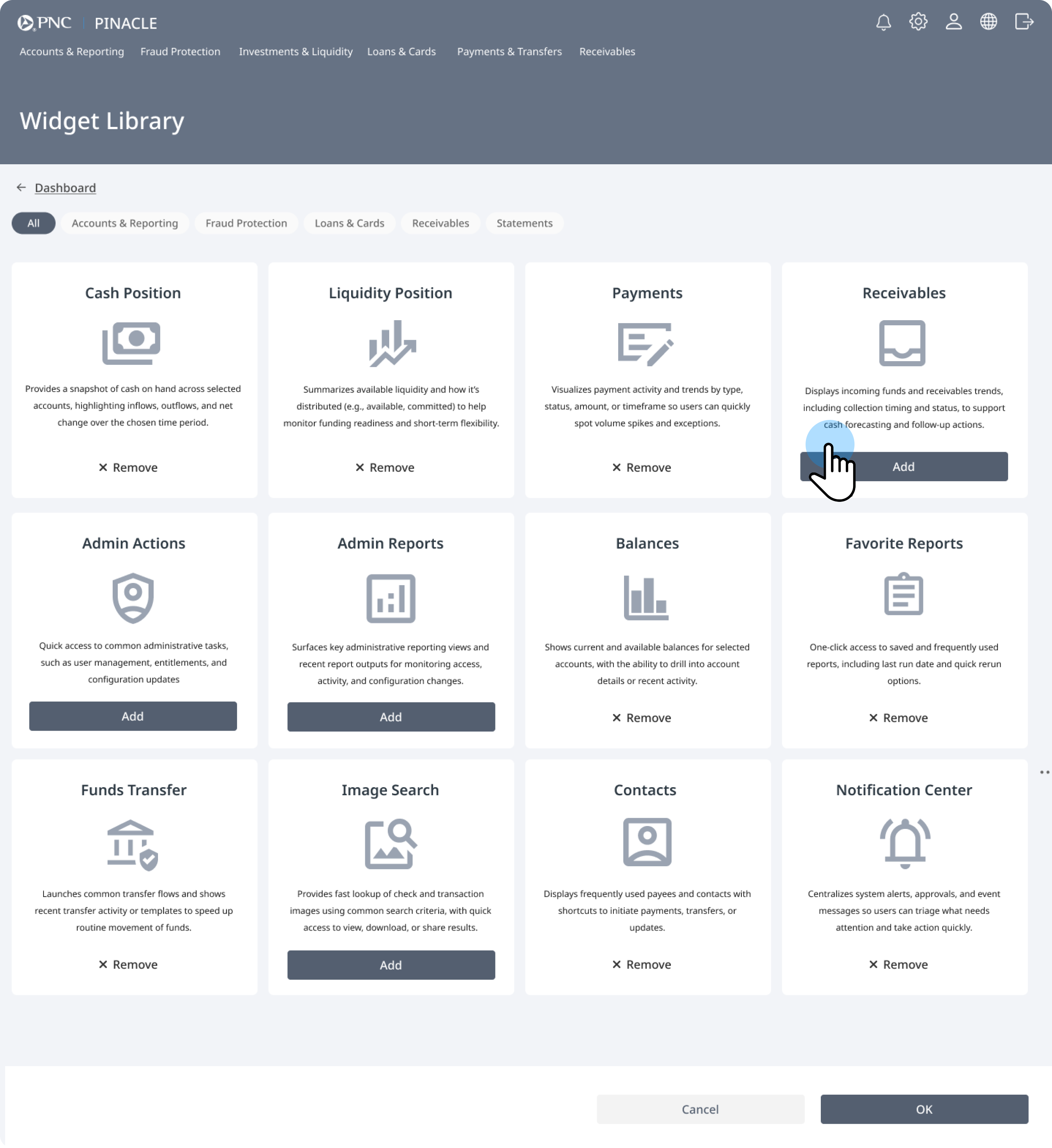
Customization through a governed widget library—not free-form chaos.
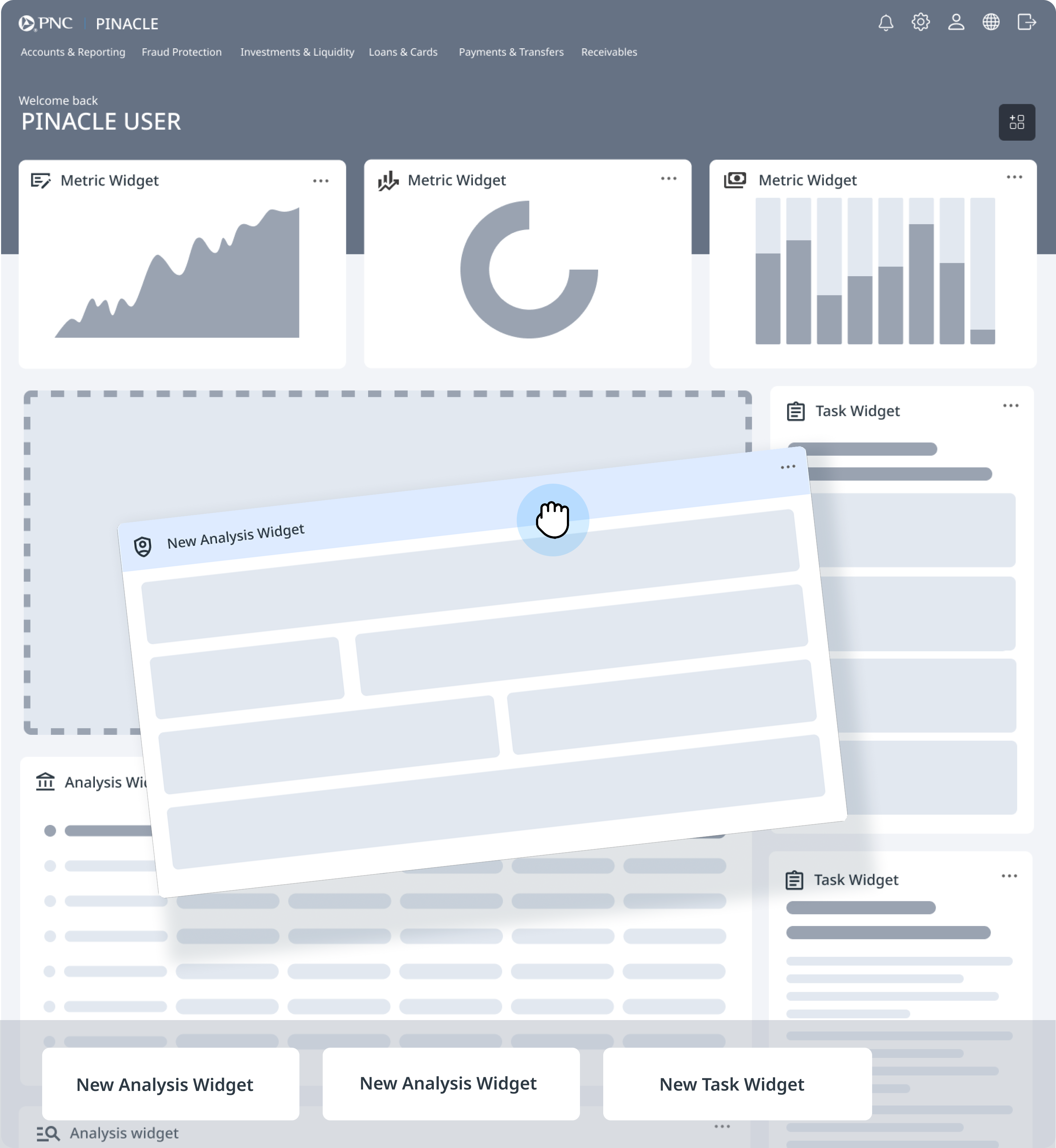
A service-based catalog, drag-and-drop placement into defined zones, and save/confirm patterns make personalization feel controlled. Users get relevance without breaking shared mental models.
Tension · Independent teams need speed; clients need one coherent product.
A shared widget contract and delivery kit across teams.
Standard anatomy, states, accessibility, and action patterns let teams ship independently while preserving a consistent PINACLE experience—reducing regressions and support load.
DESIGN / SOLUTION
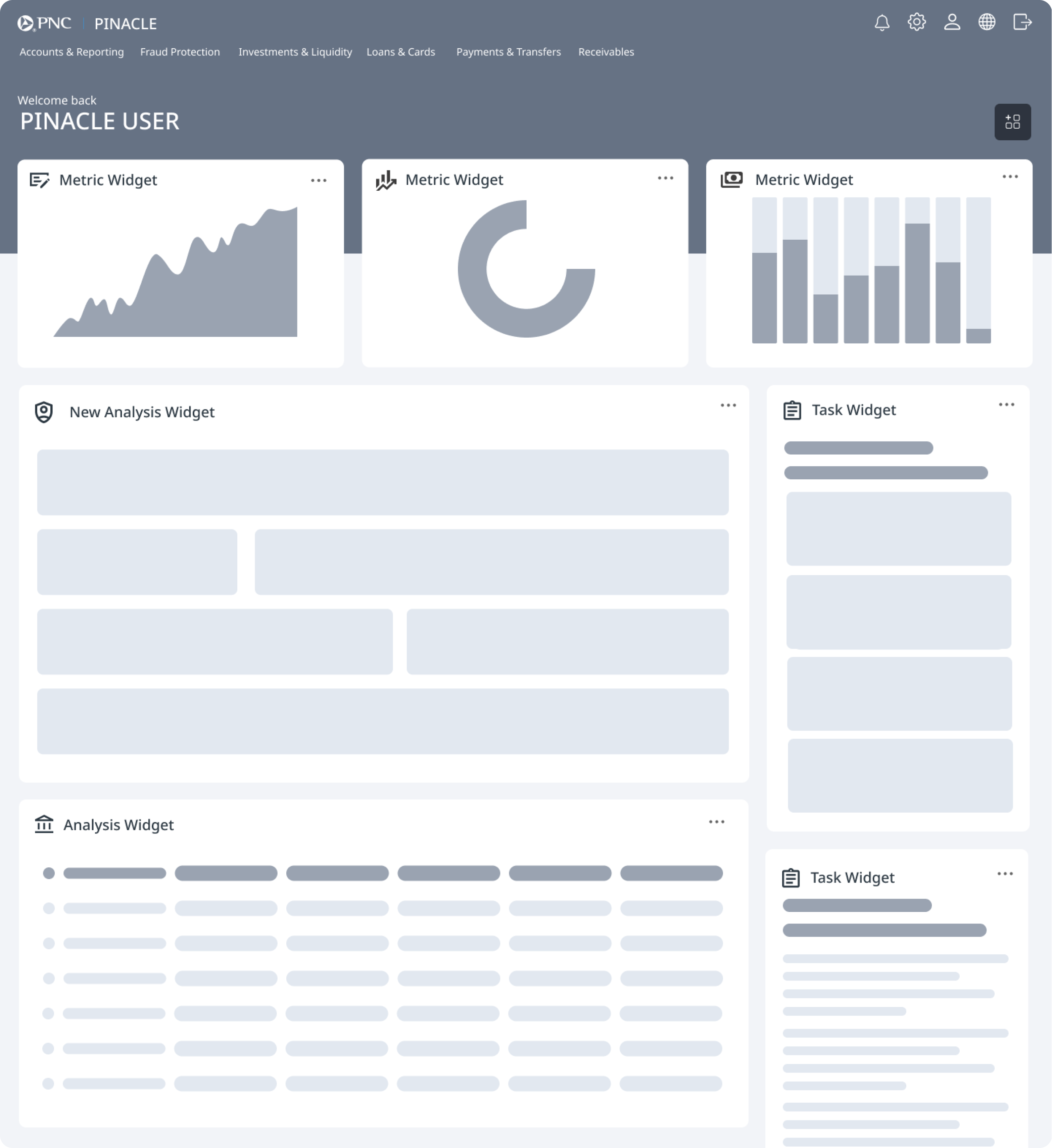
We designed a task-first, customizable dashboard by separating insight from action and standardizing how widgets behave across services—so the homepage scans fast and still supports deep work.
Layout model
The surface is organized into predictable zones: a metrics and insights strip for always-visible health indicators, a main area for analysis-heavy widgets (balances, reporting, transfers), and a sidebar for small, actionable items (approvals, exceptions, contacts, favorites).

Widget system
A service-based widget library lets users add and remove modules without clutter, while a shared contract defines anatomy, capped content, deep-link boundaries, and optional controls—keeping implementation aligned across 24+ independently owned services.


Interaction model
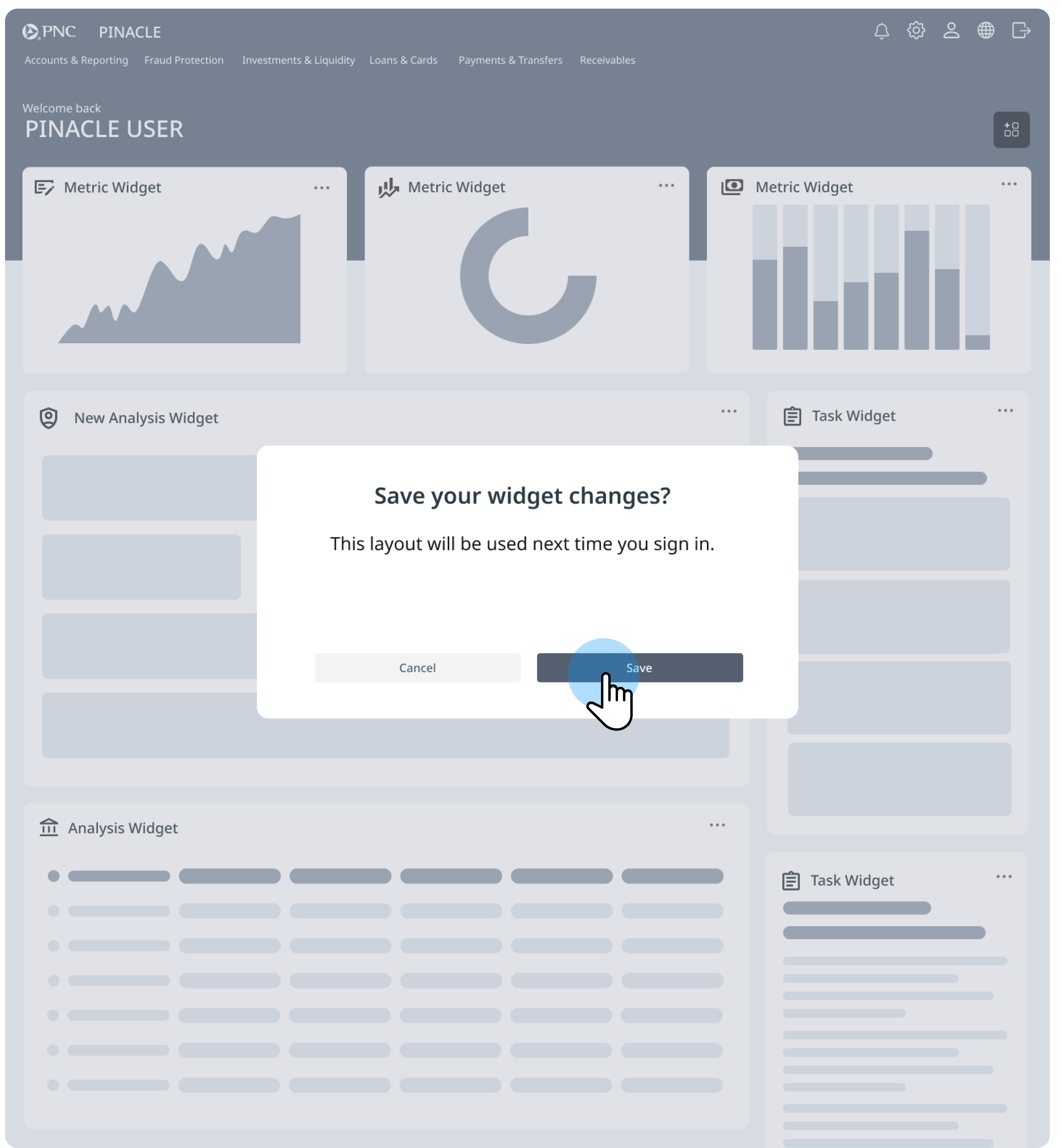
Customization uses drag-and-drop into defined drop zones with clear save and confirmation—so layouts stay legible and users understand when changes persist.

Responsive by design
Designed to scale down cleanly for mobile use. Widgets stack and resize intelligently, navigation stays usable, and the most important items—approvals, exceptions, and core balances— remain accessible for quick check-ins between meetings or while away from a desk.
TESTING
We validated that clients could understand personalization, trust widget data, and use the dashboard confidently across roles—then iterated based on what we observed.
Method
- Internal validation with design + product teams to refine workflows, edge cases, and widget states.
- Client validation at PINACLE User Group sessions using low-fidelity prototypes and guided tasks.
- Iterative testing to balance customization, simplicity, and performance.
Customize your dashboard in 5 steps
Validated
- The layout zones and widget model were easy to understand.
- Clients could follow personalization and trust widget data in guided tasks.
Changed
- Improved personalization entry points and clarified feedback and saving behavior.
- Tightened widget sizing and grid constraints so layouts felt predictable.
These updates were rolled into the widget contract / interaction requirements to keep implementation consistent across teams.
Implementation & Scalability
Shipping a customizable dashboard across 24+ PINACLE services required a deliberate platform architecture—shared contracts, predictable zones, and clear ownership—so product teams could contribute features without fragmenting the client experience.
Dashboard Shell
The dashboard shell is the structural foundation: layout zones create a consistent rhythm—an insights strip for awareness, a main workspace for analysis, and an action sidebar for high-frequency tasks—so navigation and customization stay predictable at scale.
Cross-Product Integration
Multiple PINACLE services contribute widgets into the same shell—Payments, Accounts, Cards, Receivables, and more—each exposing curated capabilities while the dashboard orchestrates placement, entitlements, and telemetry.
IMPACT
Outcomes are directional and qualitative at platform scale—with regulatory constraints on what we can quantify publicly—but the program produced clear signals on adoption, comprehension, and operational leverage.
What changed
- Validated with clients: Dashboard concepts tested in live sessions—confirming layout, customization, and priority-action patterns across roles.
- Faster access to critical work: High-frequency widgets (approvals, exceptions, alerts) surface on the homepage, reducing reliance on deep navigation for daily actions.
- Built to scale: A shared widget framework and interaction contract support consistent contributions across 24+ teams.
- Role-aware first load: Foundation for defaults that improve day-one relevance and reduce setup friction.
Proof signals (qualitative)
- Reduced navigation hopping in early tasks—users could spot priority actions from the dashboard.
- Faster orientation in the first 60 seconds: clearer sense of where to start and what needed attention.
- More predictable implementation outcomes via shared constraints, zones, and definition-of-ready standards.
- Fewer late-stage UX escalations as teams aligned earlier on boundaries and interaction expectations.
Directional and qualitative due to platform scale and regulatory constraints.
REFLECTION
This project required not just design innovation, but orchestration across dozens of teams and stakeholders. My role was to keep the vision unified, ensure client voices were consistently represented, and give developers clear requirements for complex workflows.
Leading this effort reinforced the importance of balancing strategic direction, hands-on design work, and cross-functional facilitation in large-scale enterprise design programs.
Orchestrate, don’t dictate
Align dozens of teams around shared contracts and guardrails.
Create clarity in ambiguity
Define ownership, states, and expectations before development begins.
Stay close to users
Validate decisions continuously through client sessions and testing.